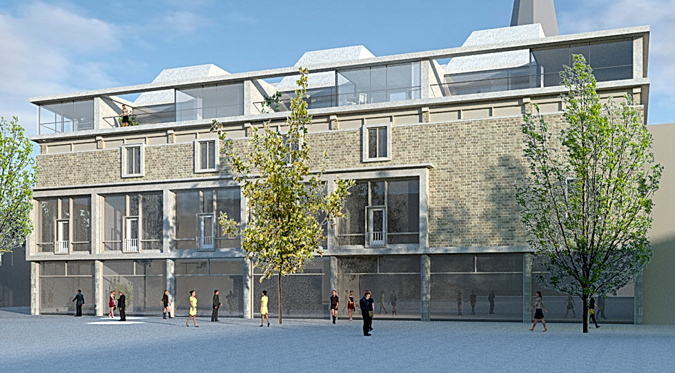
"Bischoff" building Hengelo
Transformation of a 1950's department store
Status: Competition - first prize
Year: 2011
Program: Apartments and retail
Gross floor area: 680 m2 apartments, 1100 m2 retail
Location: Hengelo, the Netherlands

The “Bischoff” building on the market square of Hengelo is an important example of 1950's urban renewal projects in Hengelo, the Netherlands.
The original design for the building by architect H. T. Zwiers had an additional storey that was never built. This was the starting point for a competition that was organised by the BNA (Union of Dutch architects).
The market square in Hengelo is an almost rectangular urban space. An additional storey to the existing “Bischoff” building will improve the definition of the urban space to the north-side of the square.

The original building was well designed with beautiful proportions. Adding too big a volume on top would reduce the existing building to a mere pedestal for the new extension.
In our winning proposal, the height of the cornice is increased to the height of one storey, big enough for people to live in. On top of this, an additional storey of smaller disconnected volumes, is set back from the building perimeter. From the square only the larger cornice, as originally envisaged by the unban plan of van Couwelaar, will be visible. Doing so respects the proportions of the original design. To create a density fitting to the surrounding urban context the new addition will cover most of the existing roof area. In order to guarantee enough daylight the building mass has to be broken-up.

Courtyards, some private, some semi-private, allow daylight deep into the building volume. Like a chessboard open courtyards and closed building volumes occupy the entire roof area. The volumes that form the upper storey of the apartments are sloped to maximise the light coming in.


Some of the courtyards are connected to form the main access route into the apartment. The last one of these semi private courtyards will function as a playground and meeting area for residents.


To the front of the building the apartments have a great view over the market square, to the back the apartments have a view over the roofs of the innercity. To make this view more attractive the apartments to the back of the building are designed around the view to the "Lambertus-tower". The view to the tower from the interior of the apartment forms the main axes connecting all the spaces on the entrance level.
Follow this link to the publication on this competition.


